Focusing on the rock concert posters of the San Francisco music scene between 1961 and 1968, the Portland Art Museum’s exhibition “Psychedelic Rock Posters and Fashion of the 1960s” emphasizes the vibrant energy of the era. While Vietnam, the Civil Rights Movement, and the Cold War raged, a group of young men and women created music and art that looked at the world head on and demanded something new. Music promoters Bill Graham (1931-1991) and Chet Helms (1942-2005) called on talented young artists to produce unique, idiosyncratic posters for their musical venues. In addition to the creation of a completely original graphic language, the poster artists of the day fashioned provocative and pulsating designs that drew on myriad influences, from European and American Art Nouveau to Victorian lithographs, from Wild West photos to Renaissance art.
Further, these artists used purposeful distortion and surrealistic motifs to recreate the “psychedelic experience” of hallucinogenic drugs like LSD and peyote, often juxtaposing seemingly incompatible, saturated colors in their lithographs to create a vibrating and shifting visual experience, one that played with the discrepancy between the physical and the psychic perception of objects. All of this was intensified by the use of grids, swirls, and checkerboards.
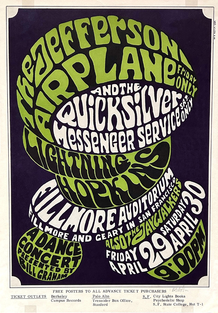
Sometimes called the Founding Father of Psychedelic Posters, the primarily self-taught Wes Wilson (1937-2020) was in the vanguard of this new form of art. In his work, the text becomes an image, and the image is all about the text. His poster for an April 1966 concert that headlined Jefferson Airplane is a prime example. Though not as colorful as work by other artists, this piece shows his inventive distortion of the lettering, which emerges as the sinuous, organic design for the entire work. When questioned about the difficulty deciphering the text, Wilson said the evasive text forced viewers to spend time with the poster if they wanted to know the bands, the location, and the dates. And he was right. People did spend time looking—and appreciating the boldness.
Besides the challenging use of text and lettering, appropriation was at the heart of the psychedelic style. Artists pulled imagery from both the past and present, freeing those images from their original contexts and giving them bold, new meanings. Anything and everything was up for grabs: Victorian valentines, Art Nouveau lettering and designs, Edwardian and Native American fashion, Renaissance paintings, Eastern and Christian iconography, even billboards for the circus and Wild West shows.
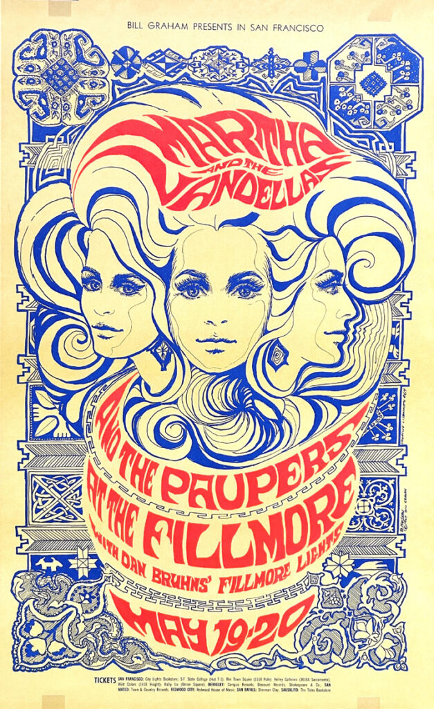
Art Nouveau design—which thrived from the 1890s to the early 1900s—was in many ways the foremost influence on the poster artists of the 60s. Bonnie MacLean (1939-2020) who was briefly married to Bill Graham and became an important force in the San Francisco rock music scene, fashioned Nouveau-inspired posters for Graham beginning in 1967. Two terrific examples from that year were created for May performances by Martha and the Vandellas and July concerts by The Doors and The Yardbirds. In both, we see the writhingly distorted lettering, the hallmark collocation of bold orange with blue, and most especially the flowing lines typical of Art Nouveau. The Vandellas poster also borrows Celtic and American Native design patterns, making that piece a complex example of appropriation. Both posters also prominently present the faces of idealized women, which became another trademark of psychedelic art.
Drawing particularly on Symbolist art and literature of the 1890s, women in psychedelic posters are not icons of the burgeoning women’s liberation movement of the 1960s, but are often presented as Earth Mother figures, love goddesses, or—most often—femme fatales. In the parallel fashion industry of the period, the popular mini-dress presented women as innocent, and childlike waifs.
But sometimes—as is the case with the 1968 Ten Years After poster by Lee Conklin (b. 1941)—the woman becomes otherworldly and/or cadaverously thin. In this poster, her arms become branch-like tendrils that spell out the names of the singing groups—a further development of the trademark sinuous lettering. This exotic presentation of the human form is quite different from the straight-forward use of photographic portraiture that other artists of the era incorporated into their work.
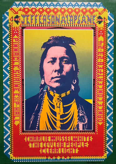
For better or worse, archival photos and other iconography lifted from Native American culture were particularly central to many poster-makers (and clothing designers). A powerful example is the 1968 poster for a Jefferson Airplane concert by John Van Hamersveld (b. 1941). The counterculture’s widespread use of such imagery (as well as dress) became what Dakota scholar Philip Deloria calls “playing Indian.” While some artists were genuinely involved in the late 60s “Red Power” movement, the majority of artists simply seized upon Native imagery and clothing without reflection; their knowledge of indigenous culture was often superficial at best. While Van Hamersveld’s poster is bold—especially with the use of colorful beading to create the lettering around the 1898 photo of a Blackfoot Indian named Thunder Cloud—there is really little connection between the visual content of the poster and the advertised musical groups or their songs.
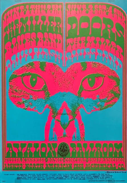
Besides Native American imagery, the lives of wild animals were also attractive to “hippies” who espoused both a back-to-the-land philosophy and an emphasis on individual freedom. The house cat as well as the untamed felines of nature were the definite winners (though we do find examples of primates, hummingbirds, elephants, and lizards). The poster for a 1967 concert by the Doors and The Steve Miller Blues Band by Victor Moscoso (b. 1936) is a classic use of such feline imagery and has been dubbed “The Pink Panther,” a reference both to the color of the cat and to the classic 1963 Peter Sellers comedy by Blake Edwards.
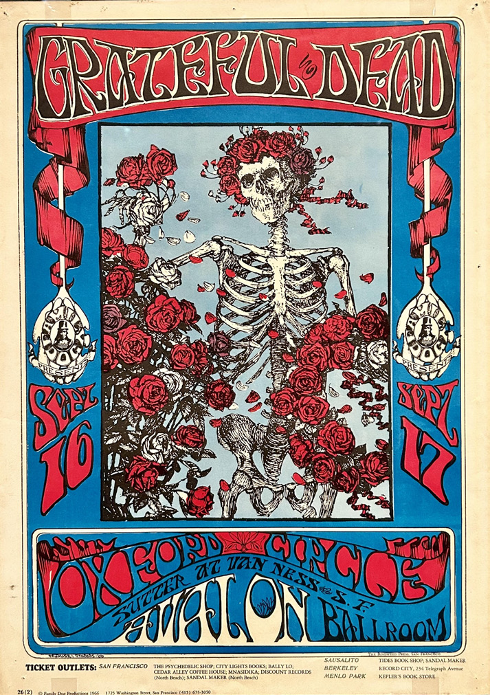
But of all the posters on display, perhaps none captures the “feel” of the era more than the now iconic “Skeleton and Roses” poster for a 1966 Grateful Dead concert by Stanley Mouse (b. 1940) and Alton Kelley (1940-2008). It’s also a classic example of appropriation. The two artists took the original black and white engraving by Edmund Joseph Sullivan of a skeleton with roses that they found in a 1913 edition of the Rubaiyat of Omar Khayyam and colored it in, framing it with “psychedelic lettering.” From that day on, the poster has become an enduring emblem for both the band and the turbulent era that spawned it.
While the world in the 60s often seemed to boil over, literature, music, fashion, and art emerged as a way to deal with those seismic events. And an important part of that exploration was the groundbreaking poster art that appropriated images of the past, invented new forms of calligraphy, and re-imagined how artists could use color. It was art that still submerges us in the culture and counterculture of a world in political, social, and creative transition—art that helps us reflect on our own turbulent times. G&S
Leave a Comment